

Best Practices for HTML Background Video Optimization
Background videos are a website staple and can make a positive impact on users, but are often not fully optimized. This post covers the main aspects of optimizing background videos.


We've always been concerned with optimizing web pages for speed but with Google's Page Experience updates in 2021, it became clear that we had more to do than just the basics if we were going to make best in class websites that could compete with others in their niche, and be delivered to the end user as fast as possible. We were going to have to take things to the next level with advanced optimization techniques (which will become the new baseline before long).
The web is flooded with companies just like yours, vying to grab a piece of people's short attention spans. We're in the same boat as you. There are thousands of web development shops out there that would love to help you with your website project, so the least we can do for you if you take the time to visit our site is to give you the info you need as fast as possible. If our own website is an example of how we build sites and what we can do for you, it had better load pretty quickly.
This post discusses what we needed to do to get our Core Web Vitals scores (a big part of Page Speed Experience) as high as possible, using our own gomasuga.com site as an example.
According to Google, Page Experience is "a set of signals that measure how users perceive the experience of interacting with a web page beyond its pure information value." Google started their rollout of Page Speed Experience in June 2021, and it should be rolled out to everyone by the end of August 2021.
Page Experience consists of four signals:
This is the most involved signal, and consists of multiple areas that target loading performance, interactivity, and visual stability, all of which lead to a "good user experience." Google has a number of tools to help measure Core Web Vitals.
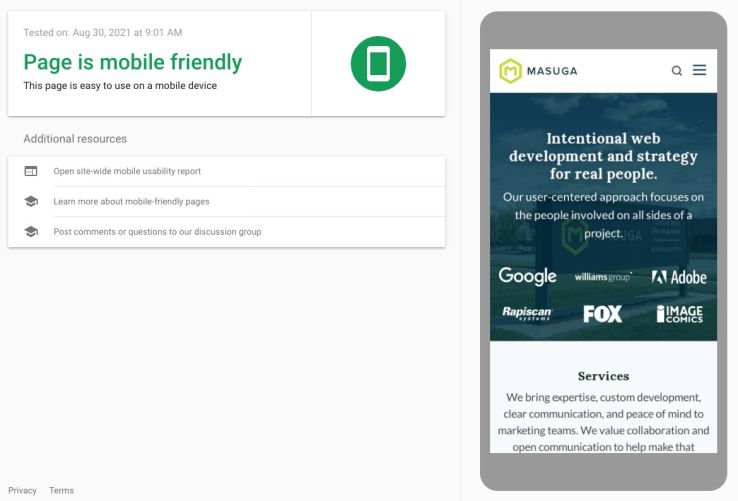
Google offers a test you can use to see if your page is mobile friendly.
Simply ensuring the web page is served over HTTPS (secure connection). This is typically indicated by a lock symbol in the location bar of your browser.
"Intrusive interstitials" is just another term for those annoying pop-ups that are all over the web and usually take over the screen asking you to join a newsletter or do some other action. We don't have any of those shenanigans on our site!
We had three of the four signals taken care of to start with. We already were built on a mobile-friendly CSS framework, were already serving pages over HTTPS, and we weren't subjecting our visitors to any interstitials. That left Core Web Vitals as our area of focus.
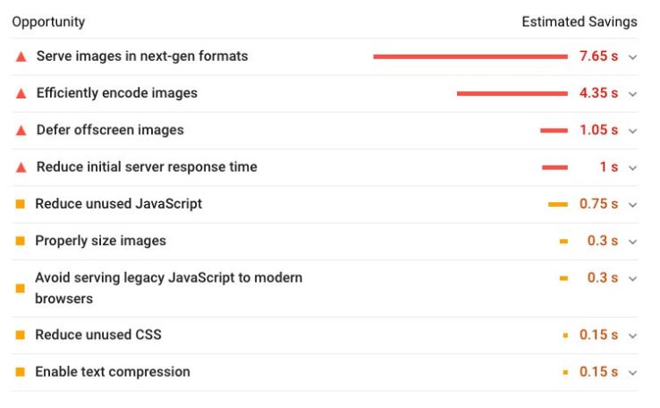
It was easy to determine what we had to do. We just plugged our web page URL into the Google Page Speed Insights tool. If you get a bad score, you're going to see suggestions listed optimistically listed as "opportunities".
The goal was simple: fix all the above! After looking through our code, we determined that the main list of items to hit consisted of the following:
Now I'll look into each of those improvements in more detail.
Images are usually the biggest contributor to payload problems (as could be seen in the opportunities screenshot, the top three things to fix revolved around images). Fortunately, they're pretty easy to fix.
First, we ensure that the source images (the images we are uploading to our site) aren't large to begin with. Images uploaded to a content-managed website rarely need to be larger in file size than 1-2 megabytes, or larger than a generous 2000 pixels in either direction. Even if your developers have set up templates on the front end to resize and cache images on the fly, you can reduce the amount of memory your site needs to perform these actions by ensuring that the images the template is working with are a reasonable size to start with.
A new development is the return of width and height declarations in the image tag markup. Web developers were previously told to remove these, because they don't make sense to have in the age of responsive web pages where the content shifts and changes size based on the size of the user's browser window, and image sizes are controlled with CSS.
However, adding width and height tags back in for each image helps with the "cumulative layout shift" score by hinting to the browser how much space to reserve for each image. PageSpeed's specific suggestion for this is to "Set an explicit width and height on image elements to reduce layout shifts and improve CLS." The less the web page shifts around when rendering, the faster it appears to load to the end user.
We default our image widths and heights to what we expect them to be in a standard desktop view, and let CSS handle the actual image sizing.
WebP images are "next generation" and can be much smaller in size while looking exactly the same as a JPG version.
Anywhere we would normally show a JPG we updated to show a WebP image instead, and use a JPG as a fallback (ensuring the JPGs are all progressive), if the user is viewing the site in a browser capable of viewing the WebP images.
We do this "either/or" selection with the picture element. A very basic example looks like this:
<picture>
<source srcset="http://www.gomasuga.com/ryan.webp" type="image/webp">
<img alt="Ryan" src="http://www.gomasuga.com/ryan.jpg" width="200" height="200">
</picture>
Browsers that can render WebP images will show that image, and other browsers will show the JPG.
Lazy loading ensures that images that aren't in the browser window when the page is loaded aren't actually loaded until the user scrolls to them and they come into view.
There are various lazy loading scripts, but we decided to use lazysizes because we realized we also needed to lazyload videos and prevent the video poster image from loading on mobile (even though it wasn't showing to the end user!) lazysizes was the only script that clearly stated it does those things. We only needed to install the unveilhooks plugin for it, which also has the benefit of allowing us to lazy load background images, scripts, and more.
We realized we had to reduce our overall JavaScript footprint. We started by eliminating the jQuery library, which for years was an automatic install for us on our website builds. We found that very often we were not using the library much, and the JavaScript we were writing with it was straightforward enough that it could be rewritten as vanilla JavaScript, not using jQuery at all.
The first thing we did was rewrite all basic JavaScript effects as vanilla JavaScript, which included our main header scroll effect, the mobile dropdown menu code, and the blog post "progress bar" that indicates how far along the user is in reading a post.
The next task involved finding new functionality that didn't require jQuery as a dependency. One example of this is for lightboxes/modals.
We used Magnific Popup as a go-to lightbox solution for years, but now needed to find something that was vanilla and had the same features. We found fslightbox.js which has a "Vanilla JavaScript Fullscreen Lightbox" (as well as lightboxes for Vue and React). For all intents and purposes it does the exact same thing as Magnific did, with no need for us to load jQuery.
Next we looked at the CSS framework we use (Foundation), and realized it's far too bloated for what we were leveraging it for. We decided to stop using Foundation and migrate to Tailwind CSS instead. With our build process, it will only include the CSS styles that we are actually using with Tailwind, which reduced the size of our CSS by an incredible amount. We really like working with Tailwind, so we've started using it on client projects as well, and began writing about how easy it is to use in posts like Creating a Flexbox Sticky Footer with Tailwind.
One of the biggest things we did to increase our Web Vitals score was to implement Critical CSS. We like easy. We like simple. Critical CSS ain't exactly simple, but in order for us to get our scores where they needed to be, we had to dive in.
Critical CSS is a technique that extracts the CSS for above-the-fold content (any content a viewer sees on page load, before scrolling) in order to render content to the user as fast as possible. That CSS is then inlined, and the remainder of the CSS can be loaded asynchronously. If you want more info on this technique, check out Google's article Extract critical CSS.
We switched up our deployment process from Gulp (which we wrote about in a 2018 blog post) to use Laravel Mix, which is lighter weight, easier to maintain, and more easily allowed us to implement Critical CSS. We wrote about Laravel Mix in our Craft CMS and Laravel Mix post.
Our deployment process now generates Critical CSS when we deploy updates to the production (live) site, and this really helped the pages appear to load instantly.
We are using a couple Google Fonts on the website, and PageSpeed was telling us to "Eliminate Render-Blocking Resources Above the Fold" - which was being caused by the Google Fonts we were using.
We found a solution for preloading Google Fonts at this Stack Overflow post. This works well in conjunction with Critical CSS.
Before, we were requesting the fonts normally, like this:
<link href="https://fonts.googleapis.com/css?family=Lora:400,400i,700,700i" rel="stylesheet">
<link href="https://fonts.googleapis.com/css?family=Lato:400,400i,700,700i" rel="stylesheet">
After adjusting them to preload, they look like this:
<link href="https://fonts.googleapis.com/css?family=Lora:400,400i,700,700i&display=swap" rel="preload" as="style" onload="this.onload=null;this.rel='stylesheet'">
<link href="https://fonts.googleapis.com/css?family=Lato:400,400i,700,700i&display=swap" rel="preload" as="style" onload="this.onload=null;this.rel='stylesheet'">
<noscript>
<link href="https://fonts.googleapis.com/css?family=Lora:400,400i,700,700i&display=swap" rel="stylesheet" type="text/css">
<link href="https://fonts.googleapis.com/css?family=Lato:400,400i,700,700i&display=swap" rel="stylesheet" type="text/css">
</noscript>
link rel="preload" as="style" requests the stylesheet asynchronously.onload attribute in the link allows the CSS to be processed when it finishes loading.&display=swap ensures the text remains visible during the webfont load.noscript is a fallback for browsers that don't execute JavaScript.More details about how this works can be found in the Defer non-critical CSS article at web.dev.
We were using Font Awesome over their CDN for icons (like the social icons you see in the site footer), which is perfectly fine, but we realized we were only using about 8 icons out of the complete set, so we were loading a ridiculously big file for no reason.
We used Icomoon to create a "font" that consisted of only the icons we were using, which drastically reduced the amount of CSS needed, and eliminated an HTTP request to another site/CDN.
We were already using a CDN (content delivery network) to deliver our assets. There are numerous CDN's out there, some of which are geared towards images (and do advanced transformations on the fly) and some are basic pull-zones.
We have a KeyCDN pull zone set up to pull static assets (e.g., JS files, CSS files, and images) from our origin server (where they "really" live). A pull zone CDN periodically pulls assets from the origin server and copies those assets to the CDN's edge servers around the world so that when a user is requesting a static file like an image, they receive a copy of the image from the server that is geographically closest to them. This helps speed up the time it takes to render a web page for the end user, whether they're in Iowa or Australia.
We were already using caching on our site, but this bears mentioning here. Our site (as well as the client sites we work on ) are built with Craft CMS, which is a database-driven content management system. For our site, we cache whole pages using the Blitz plugin with server rewriting, which means the pages load from a static file and bypass hitting the database altogether.
Regardless of the system you use, if it's database driven site you should find some way to cache the pages which will help reduce database connections, which - you guessed it - helps speed up your site.
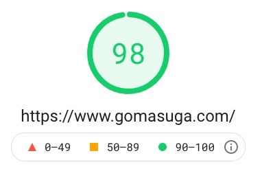
After making all those changes, we were able to reach a score of 98 on desktop.
Our main issue now is to "Avoid enormous network payloads." The main offender here is the video we have on the homepage, which is a choice we made. At least we're delivering that in optimized formats (WebM and mp4) that were optimized and compressed with Handbrake (a Mac app for optimizing video).
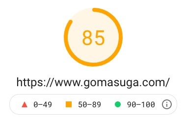
Getting the Core Web Vitals mobile score up in Page Speed Insights is much harder. At the time of this writing, our mobile score is an 85. Our pages feel fast to me when I'm browsing the site on a phone, so I'll take an 85.
The funny thing about that is that our biggest "Opportunity" is to Reduce unused JavaScript - and the JavaScript in question is Google's own Tag Manager that we use to hold our Google Analytics and other scripts, which as a 37.5 KiB transfer size.
Whether we need that is another story, as I wrote about in another post about switching off of Google Analytics.
Even if we were to remove Tag Manager, the estimated savings are 0.3 seconds.
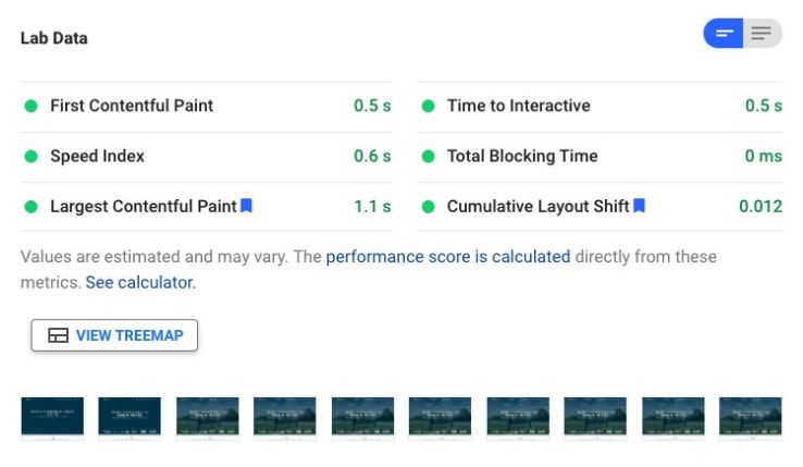
As it is, our First Contentful Paint is rendering the page in the first frame as you can see in the diagram below.
We were able to get our site to render in the first frame.
At this point, we're very happy with the results of our optimization. We're still periodically testing our site in the Google Page Speed Insights tool to see if any new suggestions arise.
We've used all of the above techniques to optimize our clients' sites with great success. If you're curious to know how your site scores, head to Google Page Speed Insights and enter your web page URL. If you're feeling adventurous, check out your competitors' sites, too, to see how you compare.
If your site is on Craft CMS and your scores are poor, contact us! Perhaps a round or two of advanced customization will have a direct impact on your Page Experience scores and overall user satisfaction with your site.
Background videos are a website staple and can make a positive impact on users, but are often not fully optimized. This post covers the main aspects of optimizing background videos.
Here's how we converted our own site from Foundation to Tailwind, along with a cheat sheet to help you do the same.
User privacy is a growing concern on the web. Websites using Google Analytics to track user behavior contribute to the privacy problem, but there are many privacy-focused web analytics alternatives to use instead.
We respond within one business day and will tell you honestly whether we're the right fit.
Schedule a Call